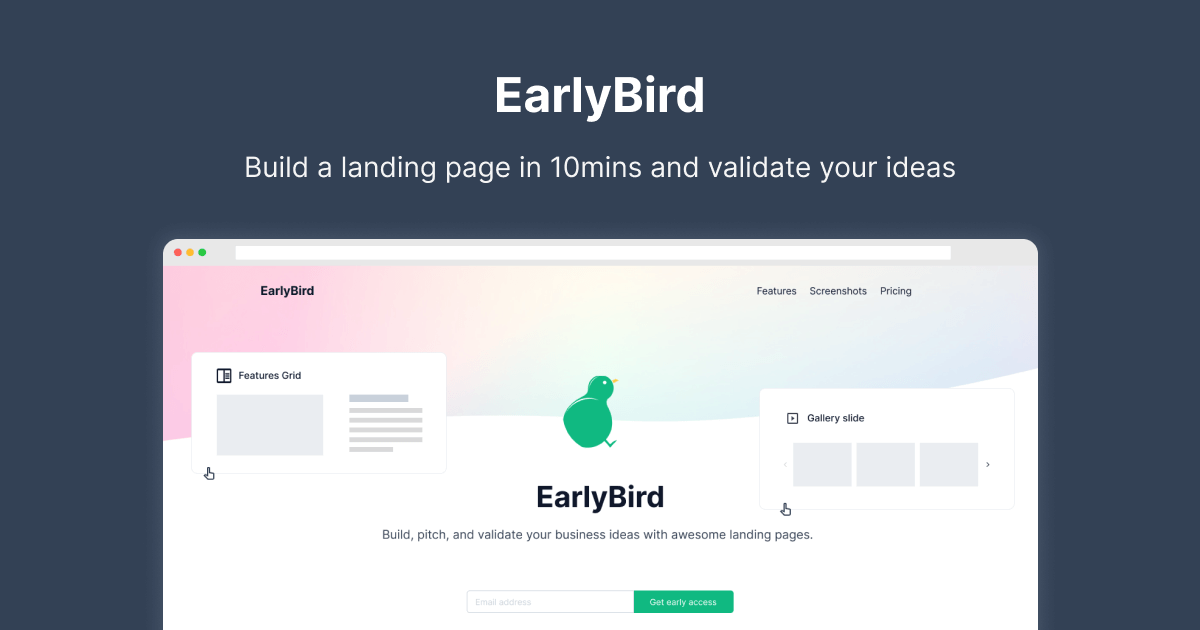
Best Practices for Great Landing Pages
In the Chapter 2, Part 1 of Landing OS series, let's look at how we can develop a highly effective landing page for an idea.

Read previous chapter

Using industry best practices for landing pages is essential because it ensures that your page is optimized correctly to capture and convert visitors.
By designing and writing a landing page with the right elements, such as a strong headline, persuasive copy, visuals, customer testimonials and reviews, a clear CTA, and tracking performance metrics, you can create an effective page that will increase customer engagement while driving conversions.
Additionally, using A/B testing to compare two versions of the page makes it easier to find out which design works better with different audiences so you can maximize success when launching the page publicly.
Your landing page is the essential element of your website. It's the first page visitors come to when they find your site, which will keep them there. Creating an effective landing page means understanding the industry's best practices for optimizing user experience and boosting conversions.
Let's look at how you can develop a highly effective landing page for an idea.
Top Landing Page Best Practices
Here are the top best practices for creating successful landing pages in the industry:
Keep it Simple
The most important rule for creating a successful landing page is to keep it simple. Too many images, advertisements, and other content can overwhelm visitors and make it easier for them to find what they want. The more clutter on your page, the less likely people will stay on it. Make sure your landing page has only the essential information you want visitors to see—no more and no less.
Focus on Quality Content
When it comes to creating a successful landing page, quality content is key. Your content should be informative and concise so that readers can quickly get the information they need without wading through pages of text or complicated graphics.

Make sure that all of your content is relevant to the topic at hand so that visitors don't feel like they are wasting their time reading something unrelated to what brought them there in the first place.
Make Use of Visual Elements
Visual elements like images, videos, and infographics can be incredibly effective tools for making your landing page more engaging and interesting for visitors. They also allow visitors to get more information about your product or service without reading through long text blocks.
Make sure that any visual elements you include are high-quality to avoid detracting from the overall experience of visiting your site. Adding visuals such as videos, images, or screenshots will make your page more engaging and help to strengthen your message.
Clear Headline
Your headline should grab visitors' attention and give them a reason to stay on your website longer. Make sure it accurately reflects the content of your page and speaks directly to its target audience.
For example, if you're selling a new product, use language like "Introducing X Product: Your Solution to Y Problem" or "Discover X Product: The Easiest Way to Do Y Task." Be creative but also keep it focused and relevant!
Write Persuasive Copy
Writing convincing copy is essential to driving conversions on landing pages. Make sure you use language that speaks directly to your target audience's wants and needs while remaining succinct to avoid overwhelming them with too much content.
Feature Testimonials & Reviews
Including customer reviews and testimonials on your page will give potential customers more confidence in your product and services while providing an opportunity for social proofing.
Use a Strong Call-To-Action (CTA)
The most crucial element of any great landing page is the call-to-action button. This button should be prominently placed on the top of the page so visitors can easily notice it. A strong CTA is vital, as it encourages users to take action rather than just browsing away from the page without doing anything else. The CTA button should clearly explain what action you want the visitor to take—signing up for a newsletter, downloading an eBook, or buying a product.
Make sure that the copy for your CTA button is concise and direct so that visitors don't have to guess what action you want them to take.
Include Links & Forms
Incorporating additional links can help visitors explore other parts of your website. At the same time, forms can collect essential data about visitors that you can later use for marketing purposes or further engagement strategies like remarketing campaigns or email lists.
Mobile Responsive Design
As mobile devices continue to grow in popularity, so does the importance of having a mobile responsive design for landing pages. They are optimized to display properly across different devices and platforms, including tablets, phones, computers, etc.
Track Performance & Iterate
Keep an eye on performance metrics such as click-through rate (CTR), conversion rate (CVR), etc., so you can monitor effectiveness over time and easily adapt the page if needed after making certain changes or additions, etc.
Utilize A/B Testing
A/B testing allows you to test which version of a landing page works better with audiences by comparing two versions side by side in terms of design elements, copywriting, and more before launching it publicly, so you know which variants perform best among different demographics, etc.
Measure Your Results
Last but not least is measuring results; this lets you know how well each call-to-action performed and if any changes need to be made to improve conversion rates down the line!
Highlight Benefits
Your landing page should also highlight the benefits of using your product or service so that users know why they should choose you over other companies. Explain how using your product or service can save them time, money, or energy; provide them with new skills; help solve their problems; etc., so they feel confident about choosing you as their provider.
These benefits should also be backed up with customer reviews or testimonials so potential customers can prove that using your product/service will help them somehow!
Conclusion
Creating an effective landing page requires following industry best practices, such as keeping things simple, focusing on quality content, and using visual elements. By following these guidelines, you can ensure that your landing page will be both engaging and informative while also providing visitors with all the information they need to stay on your website longer and convert into customers or subscribers. With a highly effective landing page in place, you will be well on your way toward building a successful online presence!


