How to create a landing page
Thank you for signing up with EarlyBird. We are thrilled to have you on board and look forward to helping you create stunning high-converting landing pages.
Video overview of the latest release
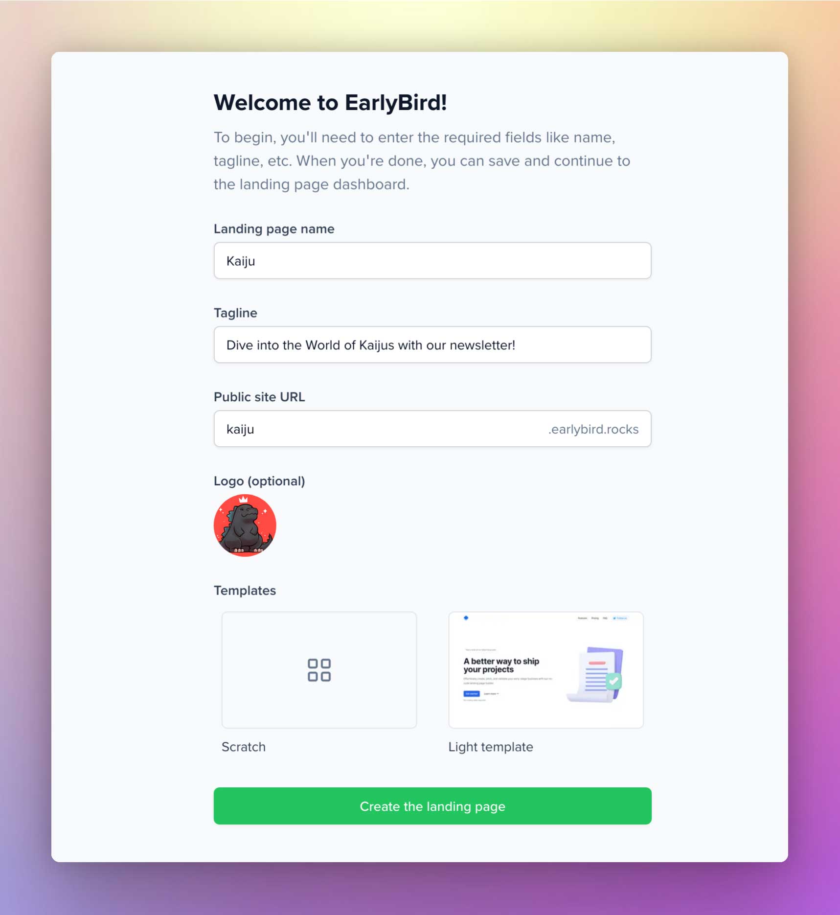
You can create your first product right after signing up with earlybird.im. The on-boarding process is quite simple. Enter a name for your landing page, set a tagline, choose a public site URL, and select your logo (optional). Then in the templates section, you could either start from scratch or select our light template. Since this is a getting started guide, I'll create a landing page from scratch.
Welcome to the editor
Once you fill in the details, you'll be greeted with the EarlyBird landing page editor and dashboard. Click on Add blocks to reveal the popup that houses all our UI blocks. Alternatively, click on the block icon in the left sidebar to reveal a panel where you can add, customize, and stack the blocks to form layouts.
And as you can see in the screengrab, you can view a glimpse of each block individually before adding them.
Basic stuff to keep in mind
- Click on the blocks icon in the top menu to enable the left sidebar view. You can disable it anytime.
- When you add a new UI block, it gets placed below the live block you're editing.
- In the left sidebar, you can drag and change the order of each block.
- You can easily delete a UI block in the left sidebar.
- When you click an active UI block in the left sidebar, a right sidebar will be visible, which contains the block settings.
- The center of the dashboard act as the panel to preview your landing page. You disable the left and right sidebars for better preview experience.
- Other icons in the left sidebar provide quick access to Code injection, Lead capture, Integrations, and settings.
How to Add a Block
Click on the block icon in the left sidebar to reveal a panel that lets you add a UI block. You can preview it in the center layout of the editor. And you can reveal the block settings by tapping on the individual block.
Types of UI blocks
We've categorized the UI blocks into Header Navigation, Hero, Feature, Pricing, Testimonials, FAQs, CTA, and Footer. And some of these blocks have multiple UI variants.
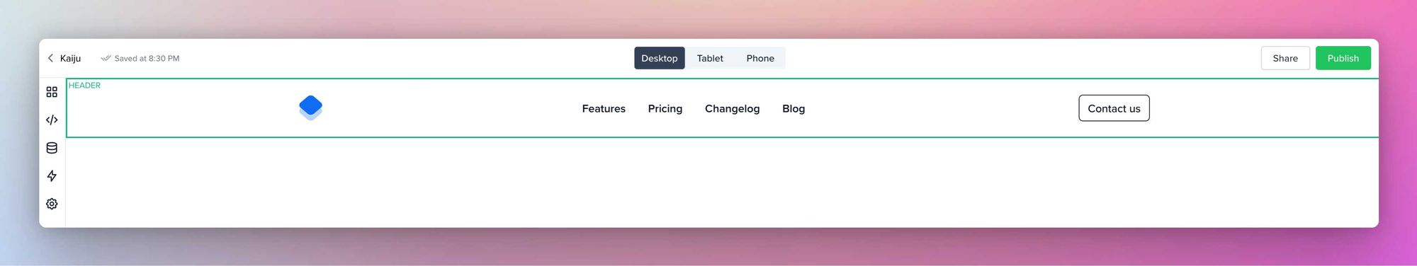
Header Navigation
You can stack up navigation links in this block. This block comes in two variants.
In the first variant, the logo goes to the left, and the navigation link group and call-to-action stay aligned to the right side.
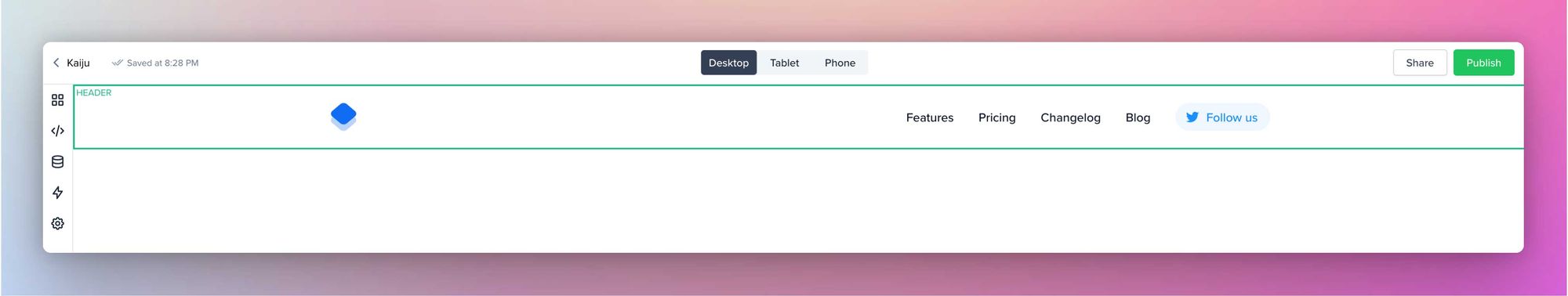
In the second variant, the logo goes to the left, the navigation link group stays in the center, and the call-to-action stays aligned to the right side.
The block settings contain individual Brand, Mobile Menu, Navigation, and Call-to-action settings.
Brand: You can adjust the logo here, and link your brand logo to an external page or one of the blocks.
Mobile Menu: As the name suggests, this is where you can tweak the appearance of the mobile menu. And for mobile menu icons, you could use either an emoji, an icon, or an image.
Navigation: You can link the navigation menu items to an external page or one of the blocks. You could also change the order of the navigation menu items.
Call-to-action: You can add CTA to the navigation and link it to an external page or one of the blocks. And for CTA icons, you could use either an emoji, an icon, or an image.
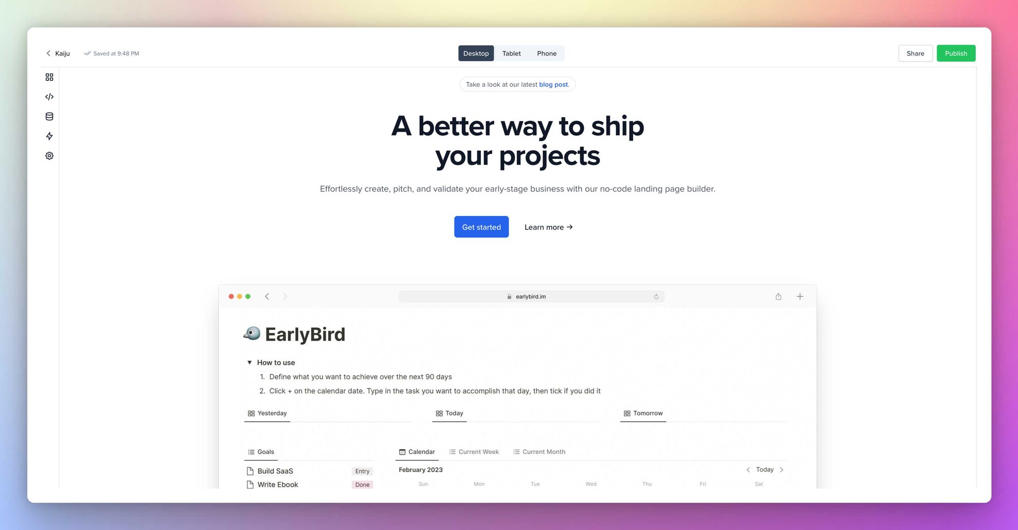
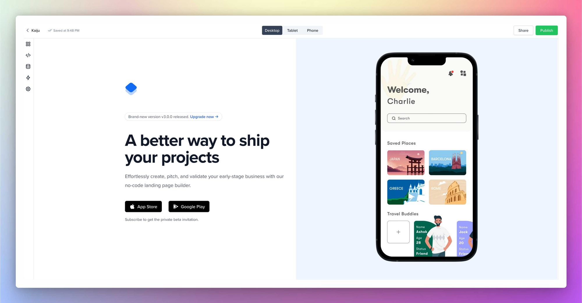
Hero
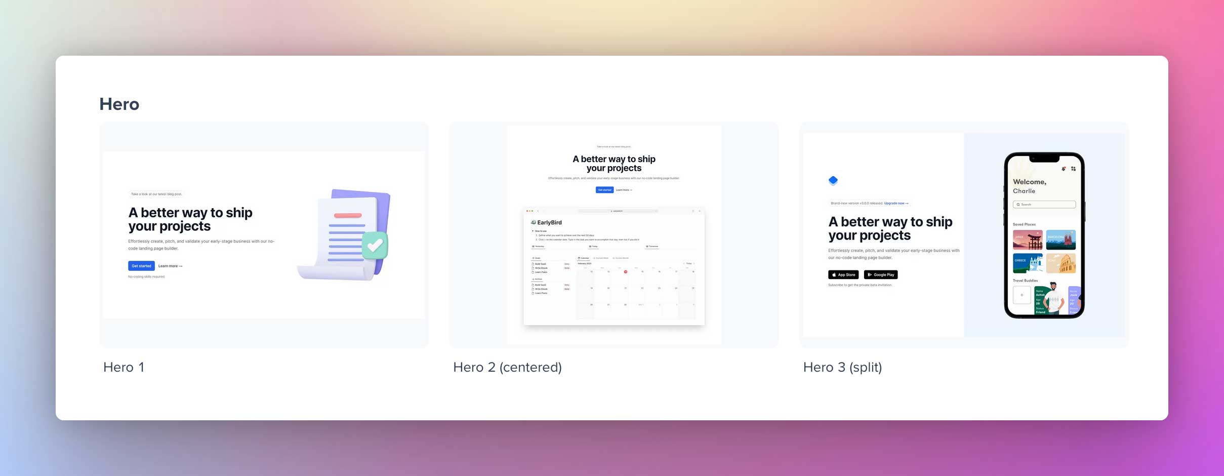
Use the Hero block to introduce your business or product. Within this block, you can add a caption, title, subtitle, description, and image representing your product. After that, you can trigger two call-to-action buttons and a bottom text. You can link the CTAs to any UI blocks you add below or to an external URL.
Here are the other two variants of Hero section:
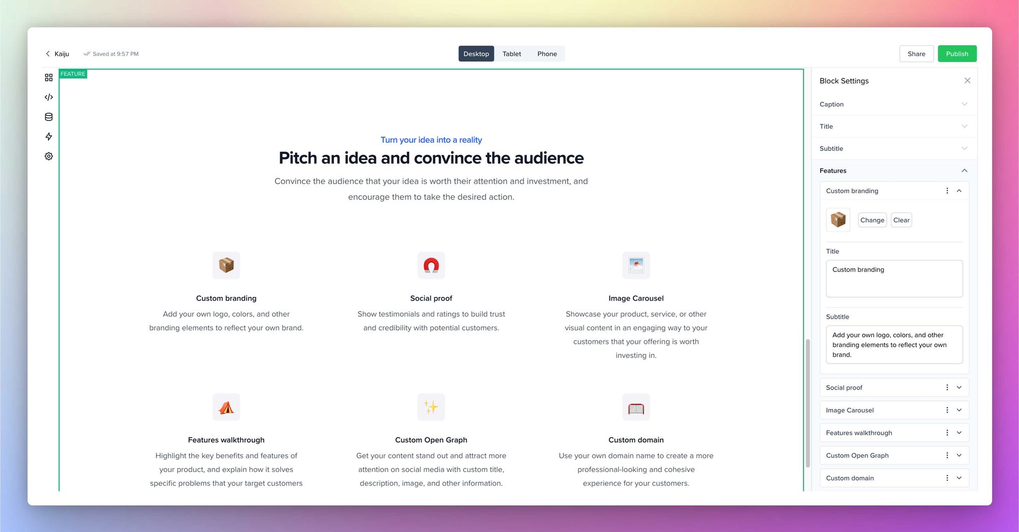
Features
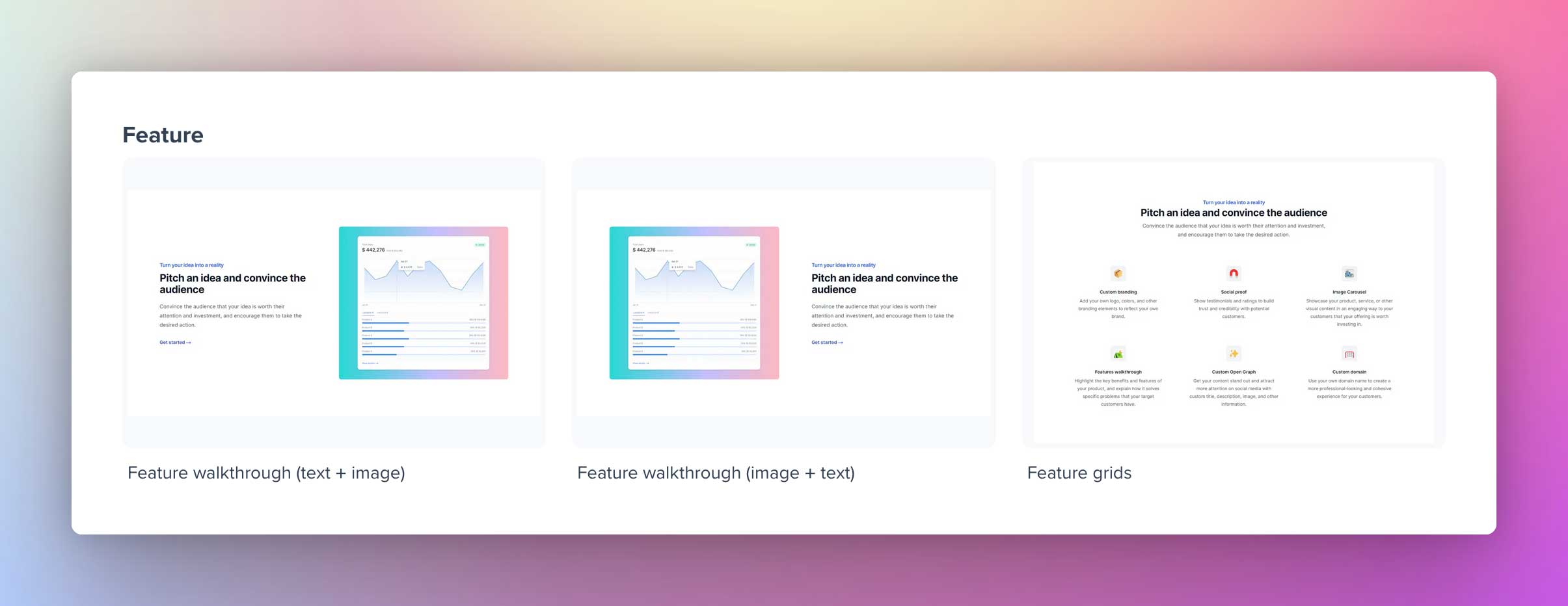
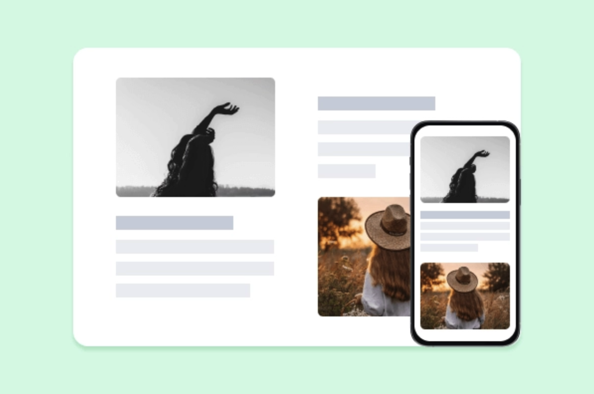
A feature block contains an image aligned to the left and a text box aligned to the right or vice versa, and this is collectively called a Feature walkthrough. You also have the option to add a Feature block in a grid style called Feature grids.
Feature walk-through block settings contain the option to edit Caption, Title, Subtitle, Call-to-action, and image.
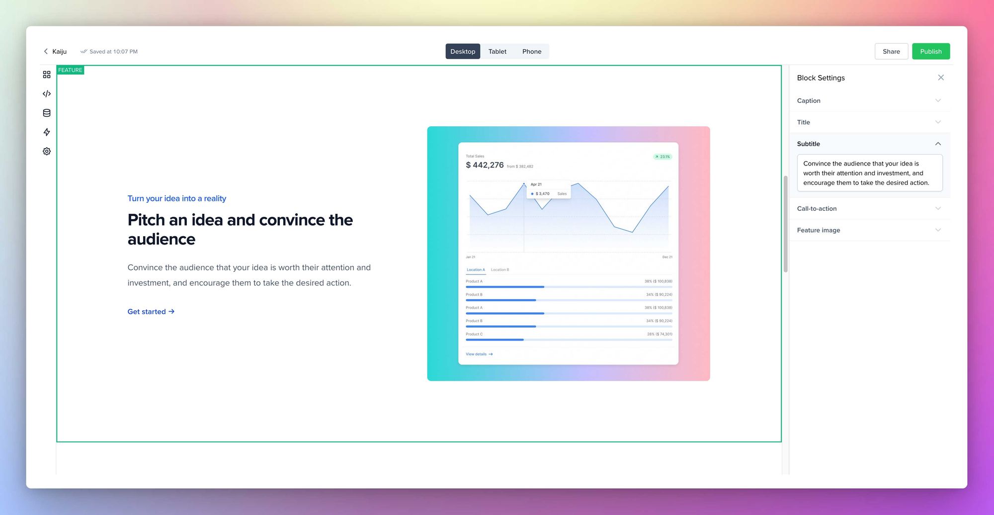
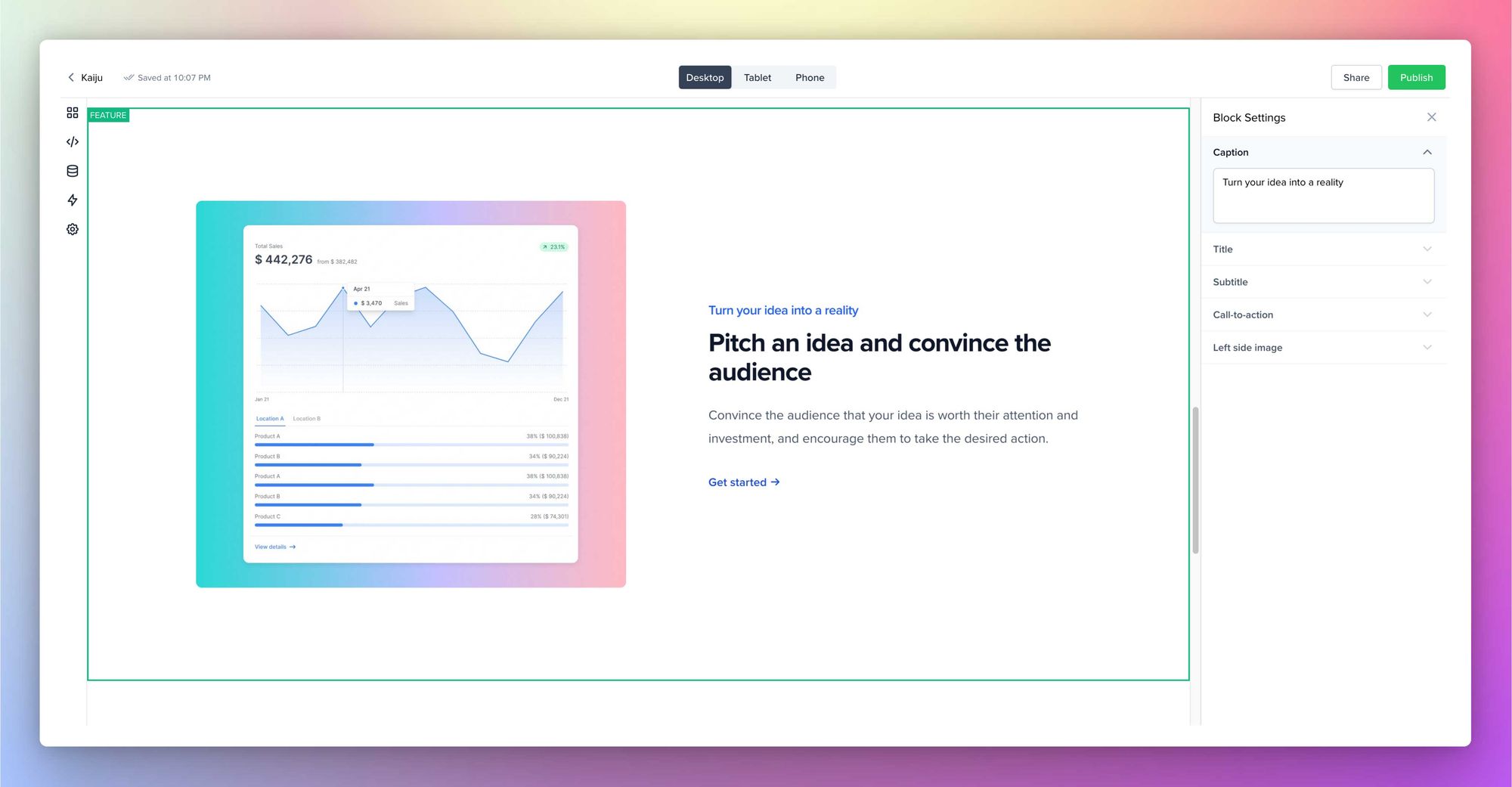
And the Feature grids block settings contain the option to edit the Caption, Title, Subtitle, and individual Feature blocks (which further contain the option to add an icon/image, title, and subtitle).
Pricing
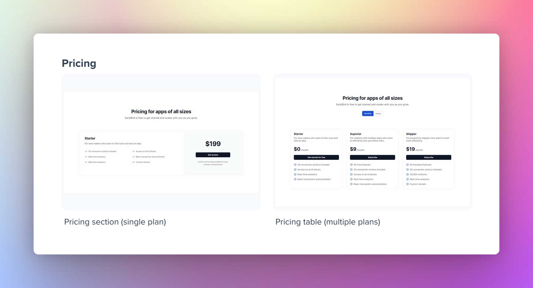
Regarding the Pricing Block, we have two design variants: The pricing section (single plan) and the Pricing table (multiple plans). Choose the one that fits best for you.
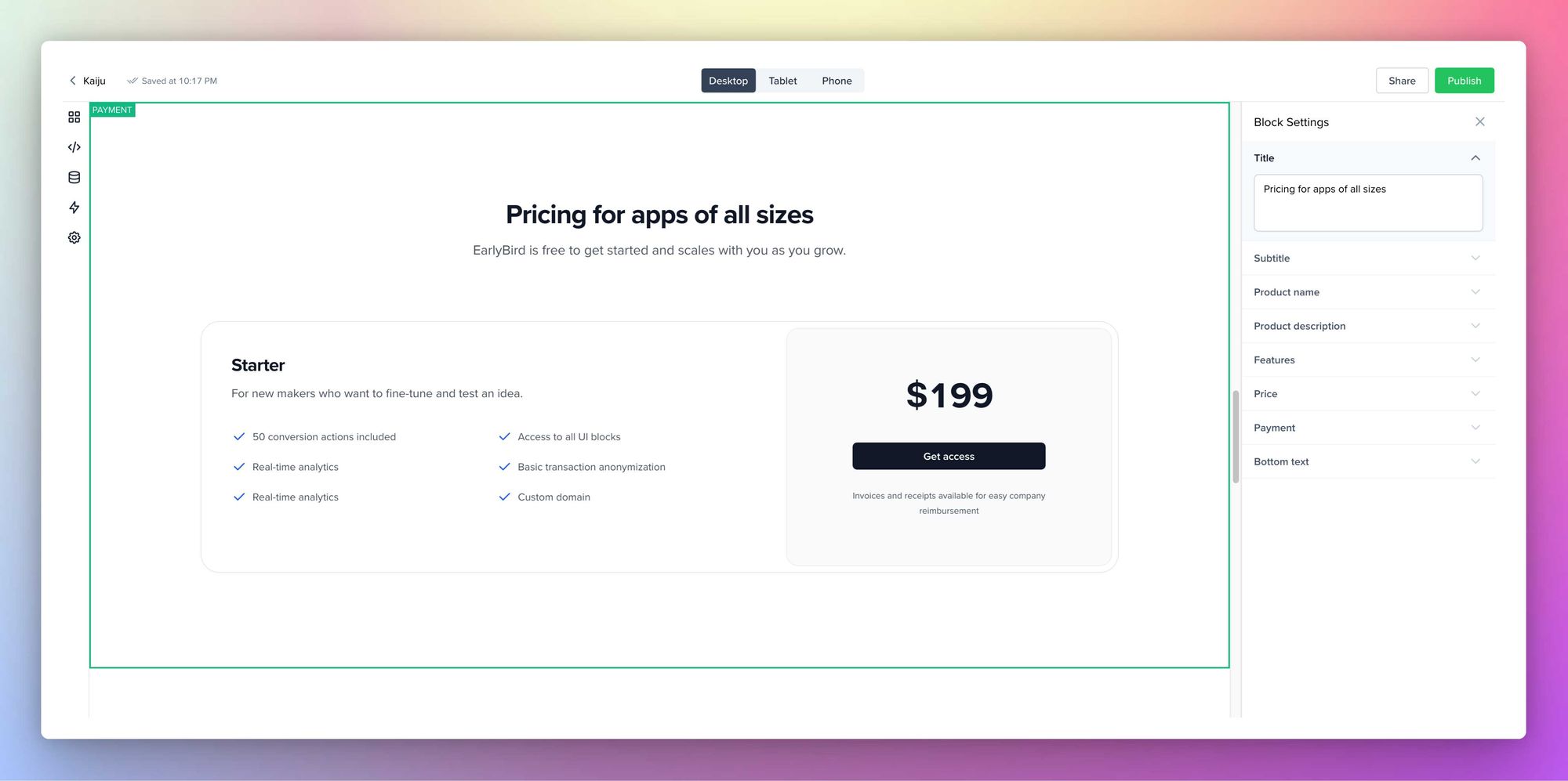
In the Pricing section (single plan) block settings, you can add the title, subtitle, Product name, Product Description, Features (where you can add multiple items), Price, a Payment field to integrate Stripe, a CTA button, and a Bottom text field.
In the Pricing table (multiple plans) block settings, you can add the title, subtitle, and different plans. Individual blocks for each plan also support adding a Plan name, Plan description, Monthly Price, Yearly Price, Payment field to integrate Stripe, a CTA button, and a Features field where you can add multiple items.
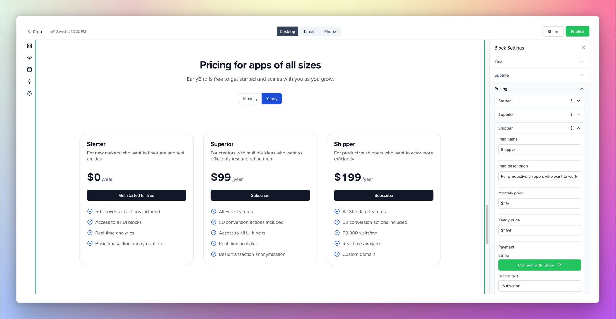
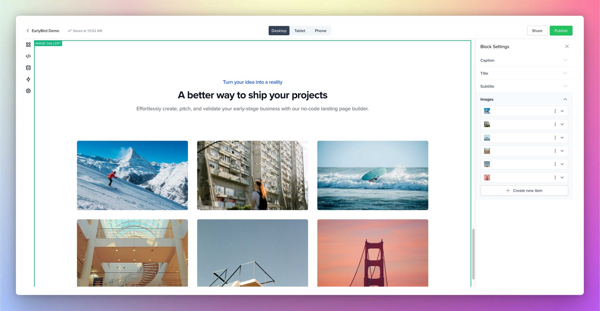
Image Gallery
An intuitive block that lets you add text, subtitles, and images to your landing page. And the images are rendered in a nice grid structure. The block settings contain the option to edit and add Caption, Title, Subtitle, and Images.
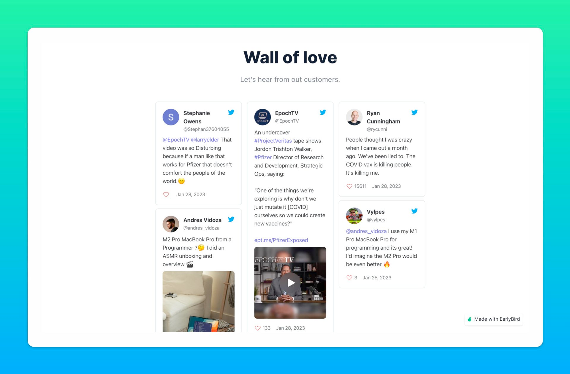
Testimonials
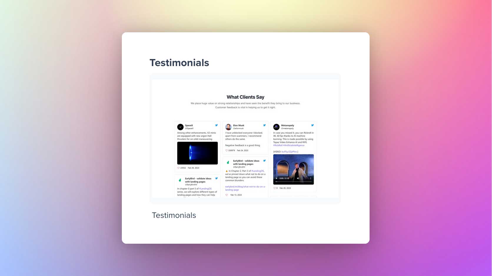
EarlyBird enables you to integrate customer testimonials from any review management platform that offers an embedded script for embedding testimonials. The Testimonials block settings allow adding the Title, Subtitle, and embed code.
One you are ready to share the social proof, copy and paste the embed code from your review management platform. We have tested Testimonials.to, Senja, and PraiseHive. If your code doesn't parse correctly, please contact our support team.
FAQs
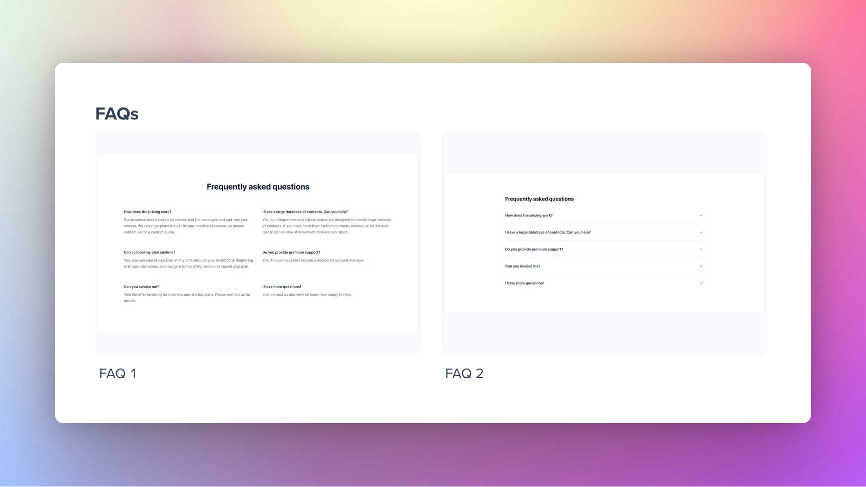
Use this block to improve the user journey by addressing your customers' needs. We offer two types of FAQ block designs. The first one is grid-like, and the other one is list-like.
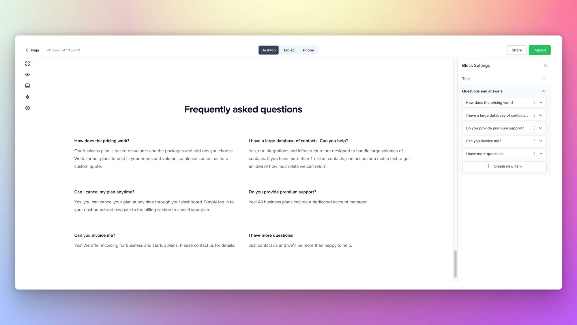
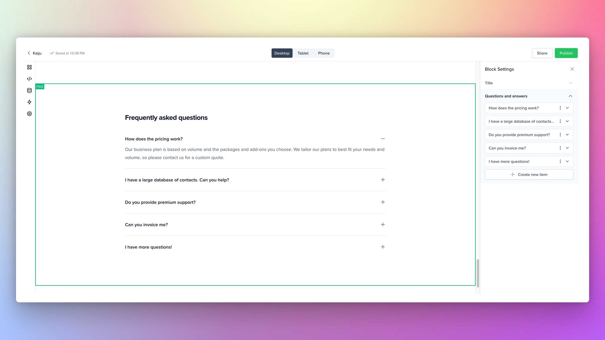
Both FAQ block settings allow adding the Title and Questions and answers. The QnA field is further separated into Question and Answer input blocks. The latter supports minimal rich text editing as well.
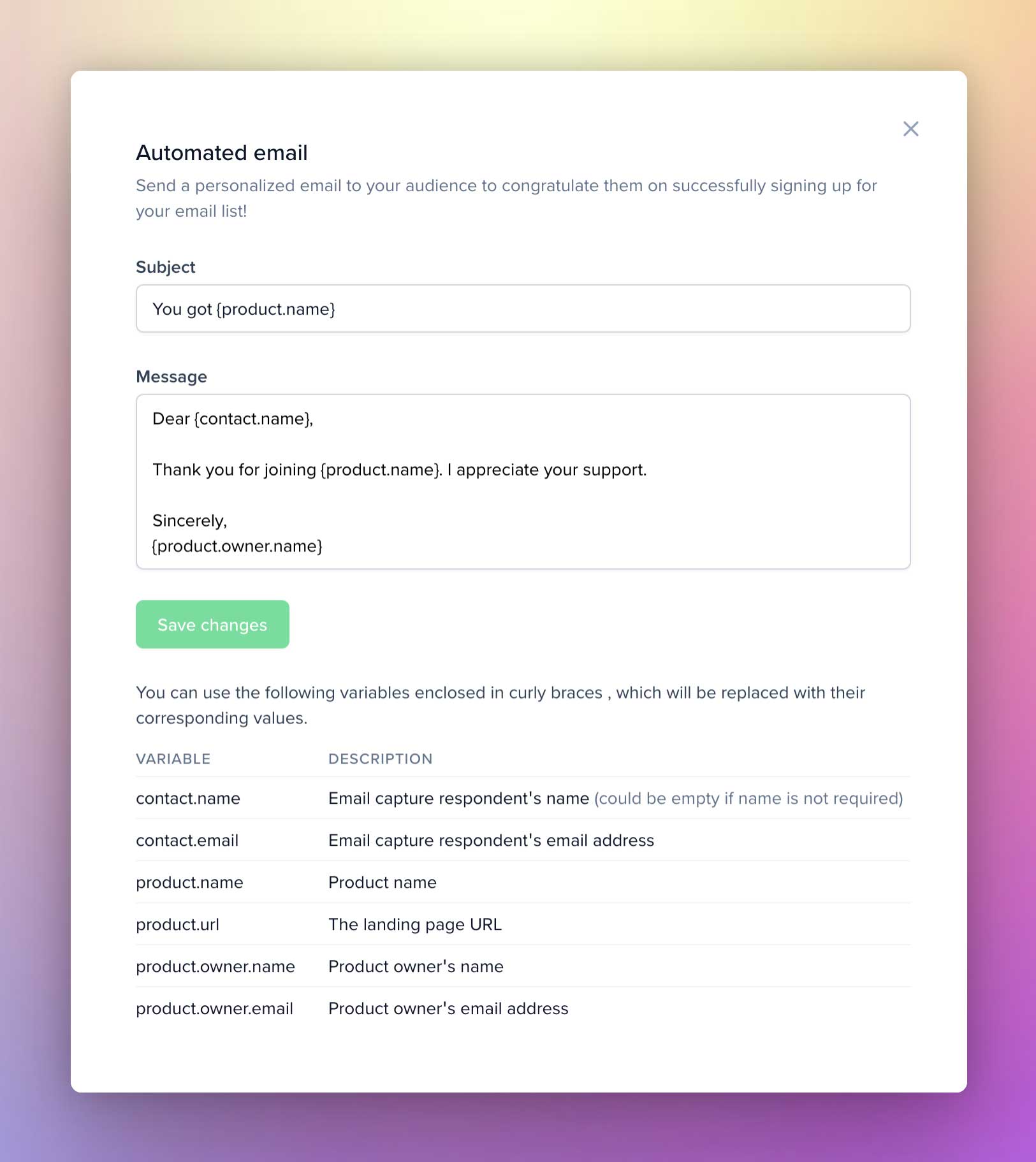
Email Capture
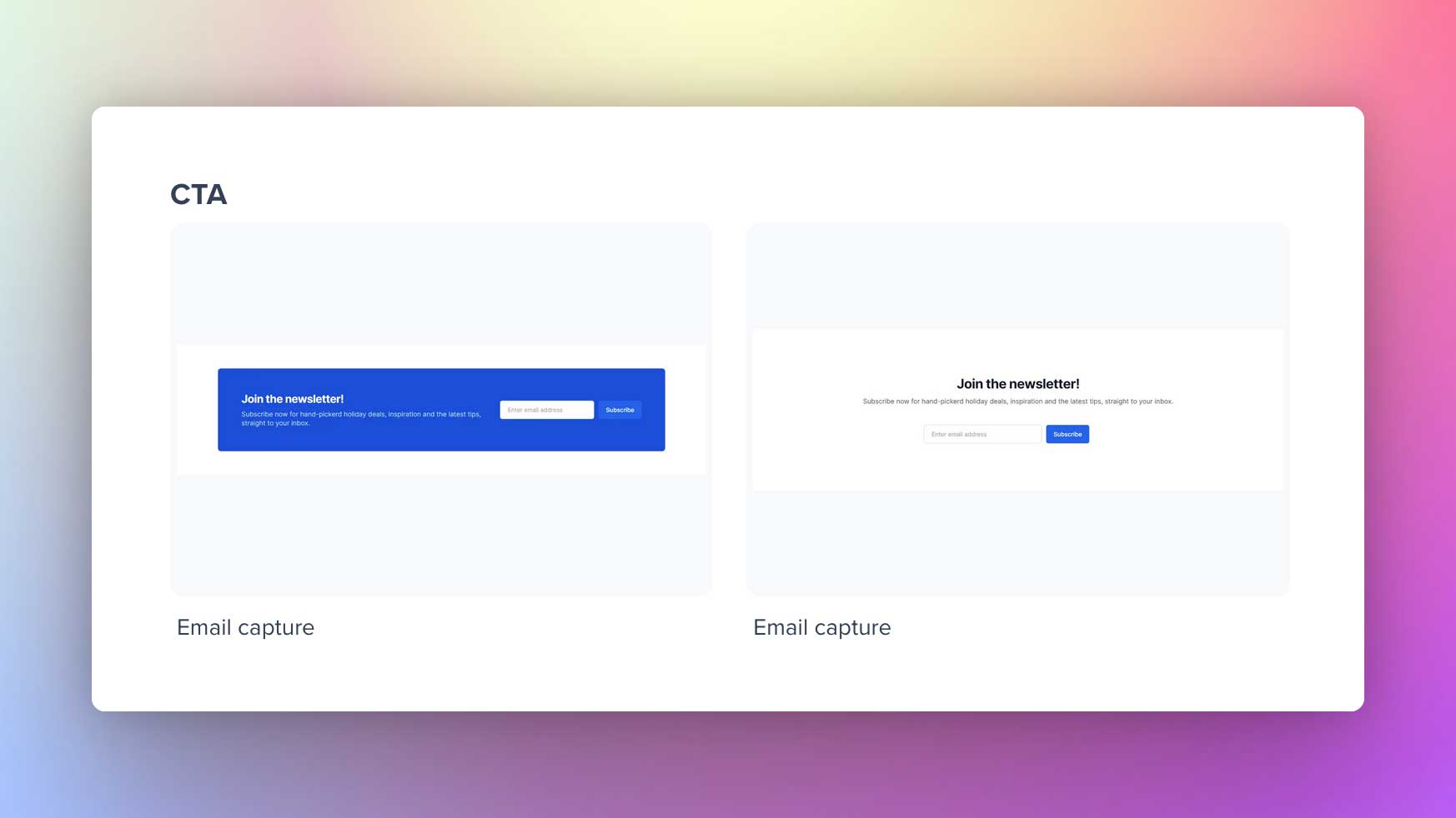
Use this block to capture leads (email addresses) and convert them. The block comes in two designs, and each email capture block setting allows you to add a Title, Subtitle, and Email capture field.
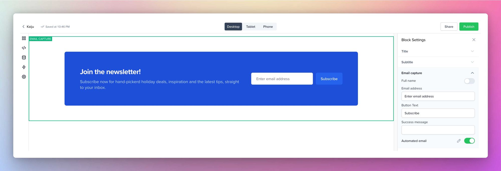
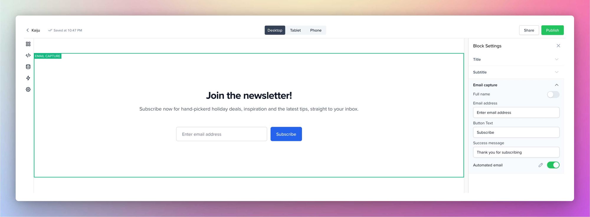
The email Capture field contains the option to collect Full Name (optional), add placeholder text, edit Button text, success message, and the Automated email template.
Footer
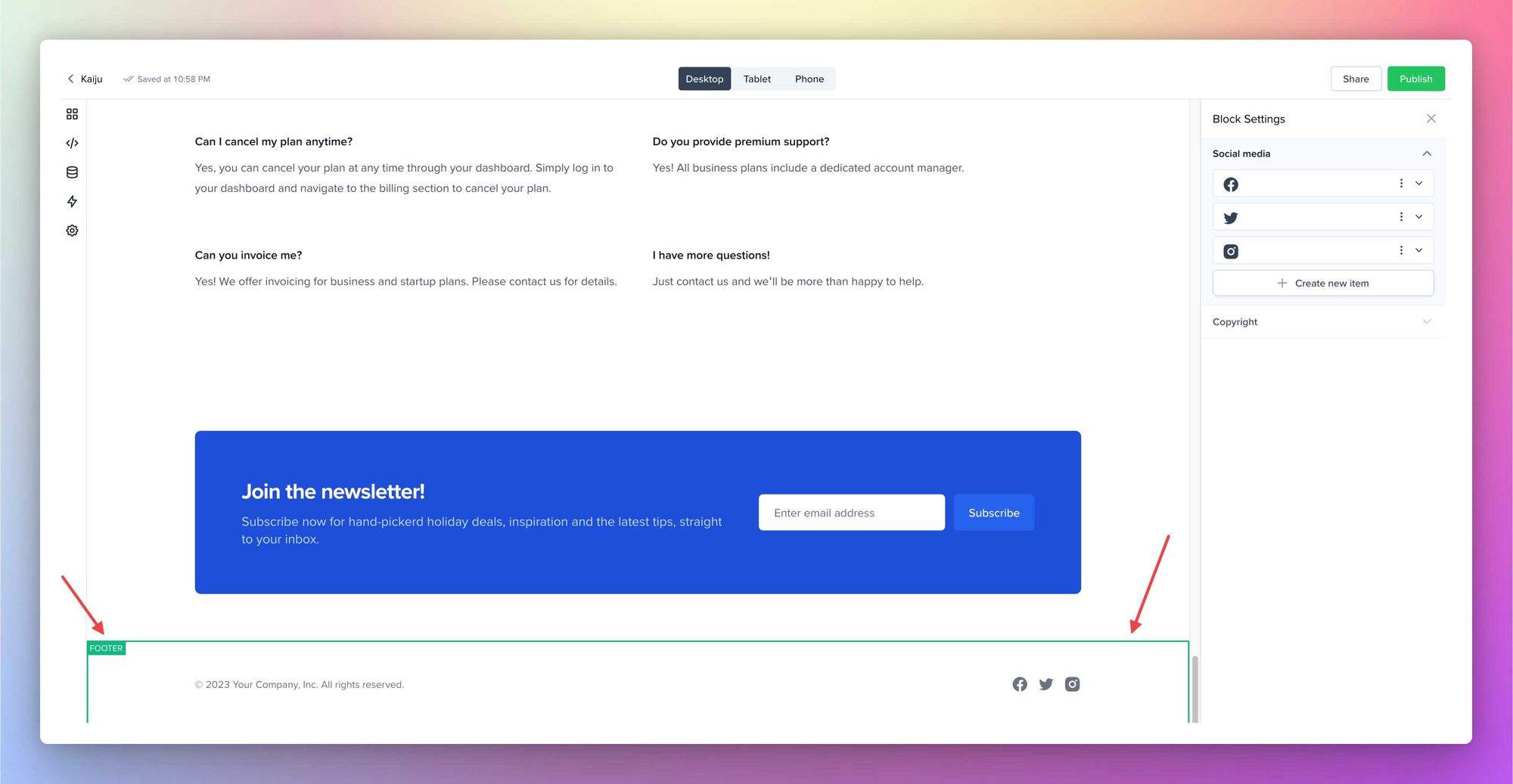
You can add social media links and copyright text in the footer. Open the social media settings and add links to your social media profiles. You can add the icons from our site, or feel free to upload images you prefer. The social media icon group stays aligned to the left side of the footer. And then, in the Copyright field, add the custom text you fancy. It supports minimal rich text editing as well.
Making your edits private
The changes you make to the landing page will be live when you click Publish. But, you can make the site private with a password and share with a select group or your friends. The privacy setting mentioned above is available in the Landing page settings within the settings page.
Settings
You can quickly access the landing page settings by clicking on Settings in the menu. The settings page further classifies into General, Site Meta Settings, Advanced, and Danger Zone.
General
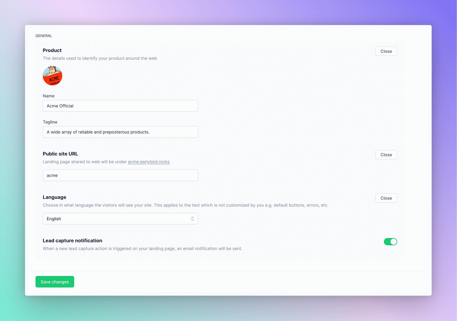
You can tweak your product name and tagline, assign the public site URL, choose a UI language, and enable or disable lead capture notifications.
Site Meta Settings
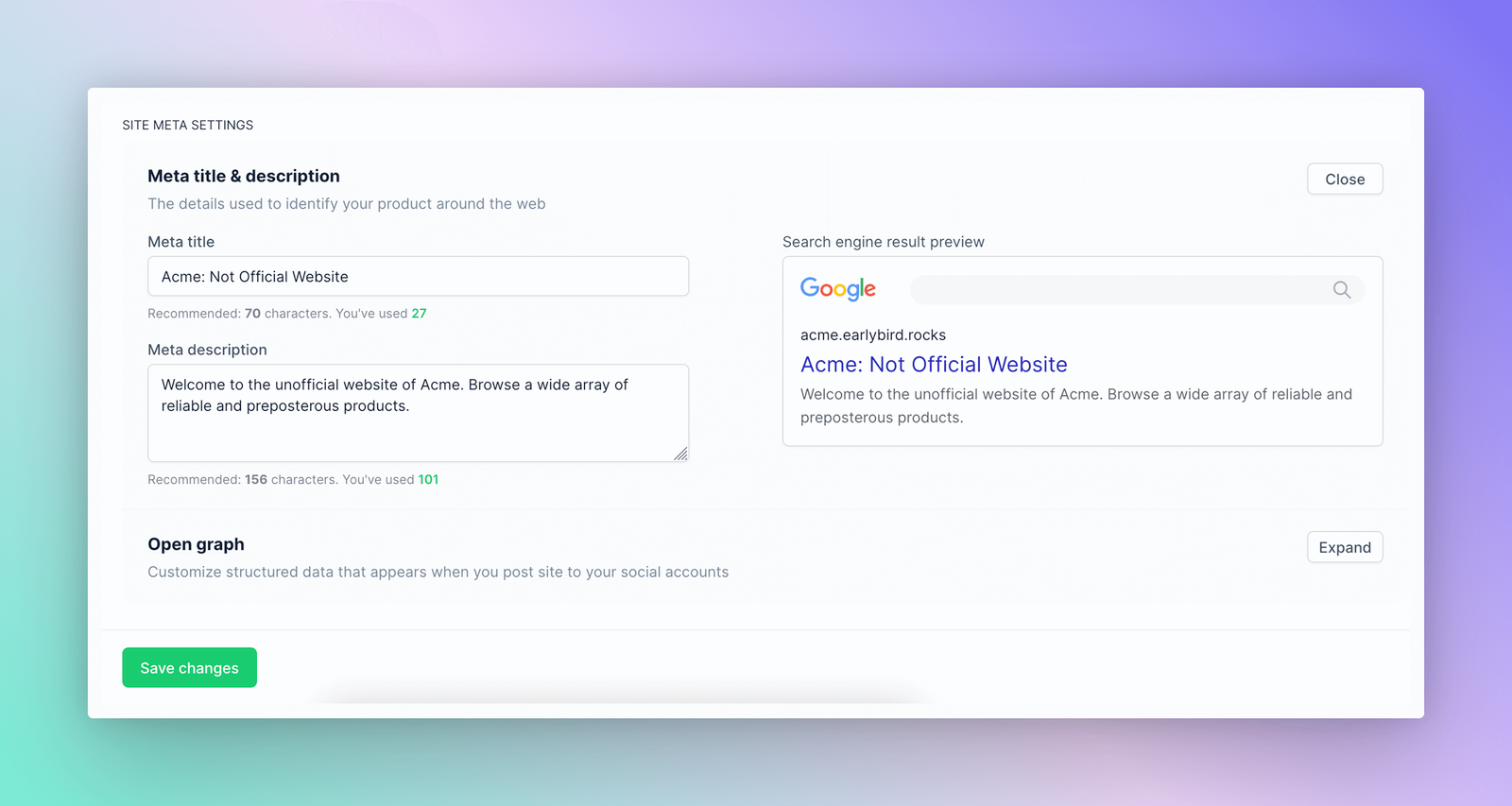
Here, you can customize your meta title, meta description, and open-graph structured data.
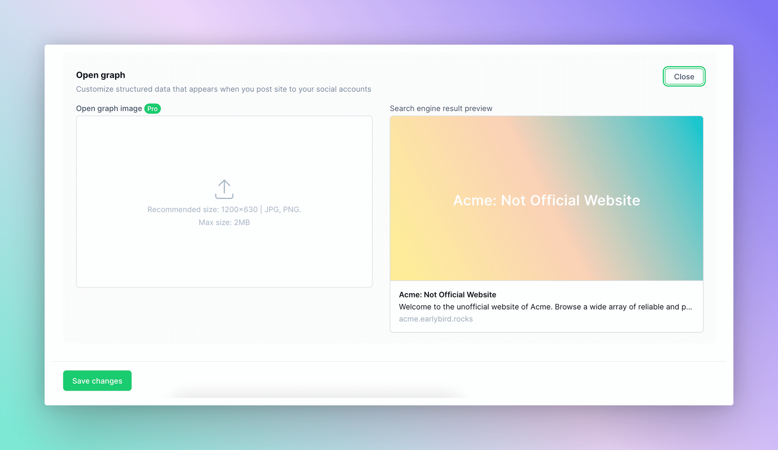
Open Graph editing is available for pro-tier users only. And the metadata default to your product name and tagline.
Advanced
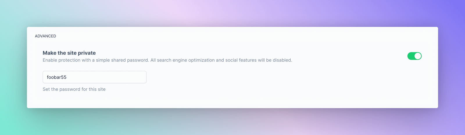
As mentioned, you can make the site private with a password and share it with a select audience or friends.
Danger Zone
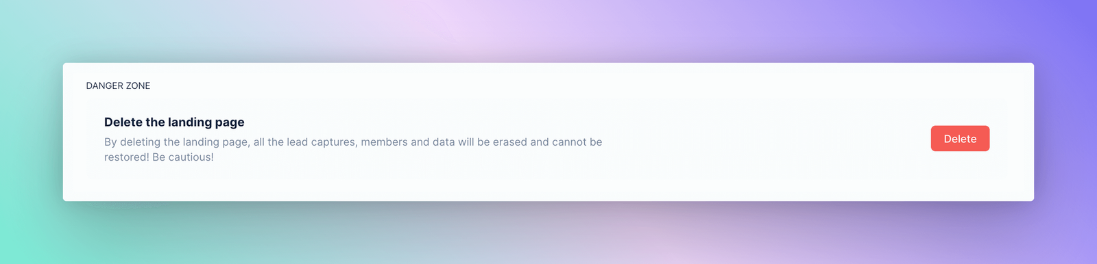
Visit this section if you want to delete your landing page. You'll be asked to provide a verification code (sent to email address) during deleting. Please note that your decision is final, and we can't restore your data if you delete it.
Need Assistance?
We strive to provide you with the best possible service and support, so please don't hesitate to reach out to [email protected] if you have any questions or need assistance.