How to Craft a Waitlist Landing Page that Sells From Day One
Learn how to create a compelling waitlist landing page that drives anticipation and boosts conversions, even before your product launches.
Creating a buzz before your product or service launches is essential for a strong start. One of the most effective tools for achieving this is a waitlist landing page.
Whether you're new to this strategy or an experienced marketer, this comprehensive guide will help you craft an engaging and impactful waitlist landing page that sets your launch up for success.
The Power of Anticipation
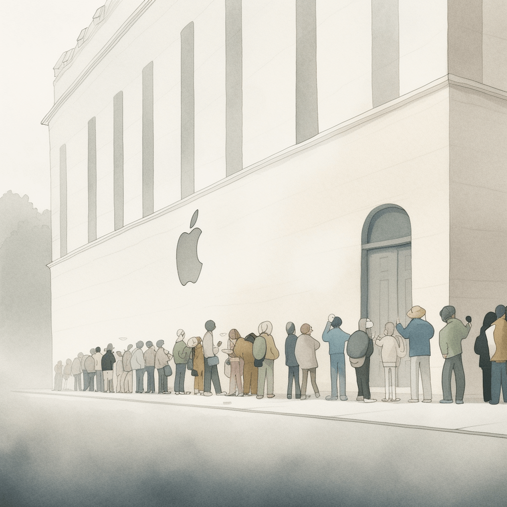
Have you ever noticed the long queues outside an Apple store every time a new iPhone is released? Or felt the rising excitement during a product launch countdown? These scenarios leverage a fundamental aspect of human psychology: anticipation. This powerful emotion forms the backbone of a successful waitlist landing page. When people anticipate something, their desire for it intensifies.
Anticipation is deeply ingrained in our need for novelty and exclusivity. The concept of waiting for something heightens its allure, as it imparts a sense of exclusivity, sparking the thought, "it must be good if I have to wait for it". This desire can generate a strong social dynamic where fear of missing out (FOMO) impels people to take action.
Designing a waitlist landing page that effectively stokes this anticipation can become a potent tool in your marketing arsenal. It transforms the typically negative experience of waiting into a positive one, brimming with excitement, curiosity, and escalated expectations. It's this twist that can captivate your audience, inspiring them to sign up and remain engaged as they eagerly await the unveiling of your product or service.
Step 1: Craft a Clear and Compelling Value Proposition
You might have the most innovative product or service ready to roll out, but if your audience can't quickly grasp why it's special, they might lose interest and move on. This is where the clear and compelling value proposition comes into play.
A well-constructed value proposition distinguishes your product in a sea of digital noise. It succinctly and convincingly tells your audience why your product or service is their best choice, addressing their question, "What's in it for me?"
Consider this from a potential customer's perspective. They land on your waitlist page, seeking a solution or a way to fulfill a need. A robust value proposition can immediately engage them by showcasing how your product uniquely meets their needs. It's this magnetic pull that can turn a casual browser into a registered waitlist member.
A good framework for crafting a compelling value proposition involves using this simple template:
However, a full-fledged value proposition often needs more depth to effectively communicate your message. Hence, you can extend this template into the following format:
Consider Airbnb for example:
Headline: "Airbnb: Travel Anywhere, Live Like a Local"
Subheading: "For travelers who want to truly experience their destination, Airbnb lets you rent unique accommodations from local hosts, so you can stay off the beaten path, learn from locals, and feel at home anywhere in the world."
3 Bullet Points:
- "Unique Stays: From urban lofts to treehouses in the wilderness, find accommodations that go beyond your average hotel room."
- "Authentic Experiences: Connect with local hosts and discover hidden gems in your chosen city."
- "Every Budget: Whether you're backpacking or splurging, find the perfect stay within your budget."
Visual: A captivating image or short video showing a range of unique accommodations offered by Airbnb hosts around the world.
Here, the value proposition clearly defines the service, speaks directly to the target audience, and highlights Airbnb's unique benefits.
For your waitlist landing page, think about the primary value your product or service brings to your customers. Then, summarize that value in a clear, compelling statement and support it with a few key benefits. Your value proposition will be the heart of your landing page, informing everything from the headline to the call-to-action. Craft it with care.
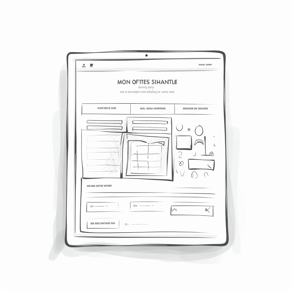
Step 2: Showcase Your Offering
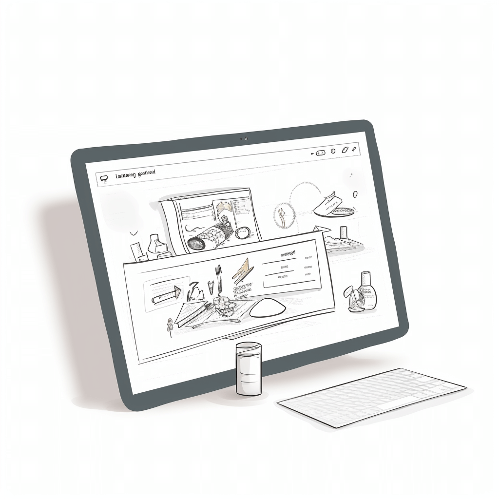
Once your visitors are intrigued by your value proposition, it's time to delve into the specifics of your offering. The devil is in the details, and this is where you let your product or service shine.
Suppose you're launching a new productivity app. Your waitlist landing page could feature a glimpse of the user interface, showing how intuitively tasks can be organized. Demonstrate the app's innovative features, like a smart scheduling assistant or integrated goal tracking. But keep the suspense alive. Provide just enough detail to entice without giving everything away. This step is all about painting a vivid picture of your offering in the reader's mind.
Remember, show, don't tell. Use visuals wherever possible — screenshots, product mockups, or short explainer videos. These assets do a great job of showcasing what's to come while creating a sense of anticipation for the launch.
Giving your audience a peek into what's in store can pique their curiosity and cement their interest, driving them one step closer to joining your waitlist.
Step 3: Leverage Social Proof
Social proof is a powerful endorsement and trust builder. It plays on our instinctive human behavior of looking to others' actions to guide our decisions. When harnessed on your waitlist landing page, it's a potent driver of conversions.
But where to find social proof when you're just starting? You could incorporate testimonials from beta testers, endorsements from industry influencers, or even flaunt the number of people who've already hopped onto the waitlist. Imagine the compelling pull of a statement like: "Join 5,000+ enthusiasts eagerly awaiting our launch."
However, keep in mind the cardinal rule - authenticity. All testimonials, endorsements, and figures must be genuine. If you're still in the pre-launch phase, securing an industry expert's opinion on your idea could add significant credibility. In this way, you create an atmosphere of trust and anticipation, making it irresistibly easy for visitors to click that 'join waitlist' button.
Step 4: Include a Strong Call to Action (CTA)
Your CTA is the pivot point of your landing page. It's the bridge that connects a visitor's interest into a committed action, converting a casual browser into a potential customer. So, this isn't the place for subtlety; your CTA needs to be bold, clear, and impossible to miss.
Consider this: Your visitor is hooked by your value proposition, they're impressed by your offering, and the social proof has built trust. Now what? Without a clear, compelling CTA, you leave them in a limbo of uncertainty. With a phrase like "Join our exclusive waitlist now!" or "Reserve your spot today!", you offer a clear pathway to the next step.
The design, color, and placement of your CTA also matter. It should stand out from the rest of the page and be intuitively placed. Test various versions, and let data guide you to the most effective CTA. In essence, make it so compelling that visitors can't resist clicking!
Step 5: Optimize for Ease of Use
Let's face it, in today's fast-paced world, people are always in a hurry. If your landing page feels like a labyrinth, visitors will simply leave. To turn visitors into waitlist sign-ups, your landing page should be as easy to navigate as a walk in the park.
Think of your landing page as a guided tour. The path from arriving at the page to joining the waitlist should be simple and straightforward. The sign-up form should ask for only essential information to reduce friction. You don’t want to lose potential customers because they had to fill out a lengthy form!
Remember, every extra step or field is a potential hurdle. Use clear, concise instructions, streamline the design, and remove any unnecessary elements. When your page is user-friendly, visitors are more likely to stay, explore, and eventually join your waitlist. Think of ease of use as a tool for conversion. Optimize it.
Wrapping Up
Creating a highly effective waitlist landing page is more than just an exercise in good design. It's about weaving a compelling narrative, building anticipation, and fostering a sense of belonging. Each step from articulating a clear value proposition to ensuring ease of use works together to create a potent mix that makes visitors want to sign up and stay connected.
Your waitlist landing page isn't just a placeholder until launch day; it's the opening chapter of your brand's story for your customers. It sets the stage for what's to come. Craft it with care, make it resonate with your audience, and watch your community grow even before your product hits the market.
One last tip: don't let the technical aspects of creating a landing page intimidate you. There are plenty of no-code solutions out there, like EarlyBird, that can help you turn your ideas into a visually appealing and high-converting landing page. They're designed with ease of use in mind, empowering even non-tech entrepreneurs to quickly test their ideas and build excitement for their upcoming product.
With careful planning and the right tools, you'll be ready to craft a waitlist landing page that sells from day one. The journey begins here, good luck!